Create Your First Project
Start adding your projects to your portfolio. Click on "Manage Projects" to get started
Acudam Branding
Branding, Signage
[08]
The re-branding for Acudam embodies inclusivity, support, and celebration. At its heart is a stylized "A" logo, where the middle line is duplicated into an equal sign, symbolizing equality and acceptance. The logo’s lines extend like arms in an embracing gesture, reflecting Acudam’s welcoming and caring spirit.
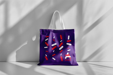
Throughout the branding, the two horizontal lines are reimagined as rounded rectangular motifs of varying sizes and positions, representing diversity. These playful shapes, reminiscent of confetti, celebrate the individuality and inclusivity that define Acudam’s commitment to improving the quality of life for people with intellectual disabilities and their families.


